What Makes a Visual Identity Feel Premium
Premium doesn’t come from expensive fonts or gold accents. It comes from consistency, restraint, and intentionality. The brands that feel high-end aren’t necessarily spending more—they’re just making fewer, better decisions and applying them everywhere.
When every touchpoint feels considered, people notice. They might not be able to explain why your brand feels polished, but they feel it. And that feeling is what separates a forgettable business from one that commands premium pricing.
Consistent typography
Using fewer fonts better will always outperform using five fonts inconsistently. Pick one or two typefaces and learn how to use them well—different weights, sizes, and spacing can create all the hierarchy you need. The moment you start mixing random fonts, the whole thing falls apart. Typography is the backbone of visual identity.
Breathing room and restraint
White space signals confidence. It says “I don’t need to shout to get your attention.” The brands that feel cluttered are usually trying to say everything at once. Premium brands let their content breathe. They trust that less, presented well, communicates more than a page crammed with information.
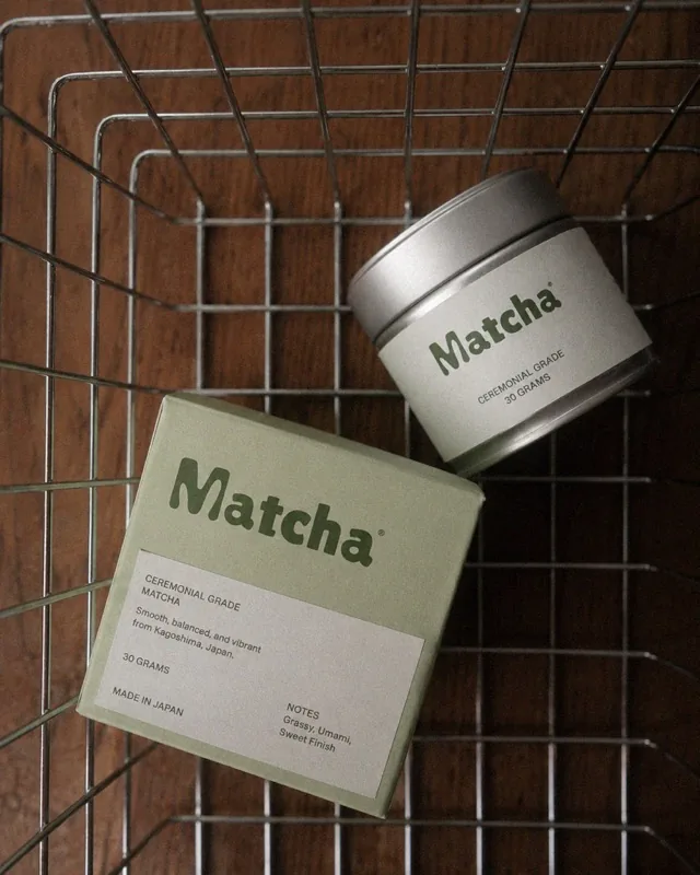
Color and imagery
A cohesive color palette—three to five colors used consistently—creates instant recognition. Pair that with quality imagery: curated photos that match your tone, not generic stock that could belong to anyone. Every image should feel like it belongs in the same world as the rest of your brand.
Premium is a feeling that comes from every detail working together. It’s not one big investment—it’s a hundred small decisions made with the same intention. When you nail that, your brand doesn’t just look good. It feels inevitable.