Éloren
Overview
Éloren is a conceptual beauty and skincare identity built around a simple idea: luxury that feels cool, clean and tactile rather than ornate.
The Direction
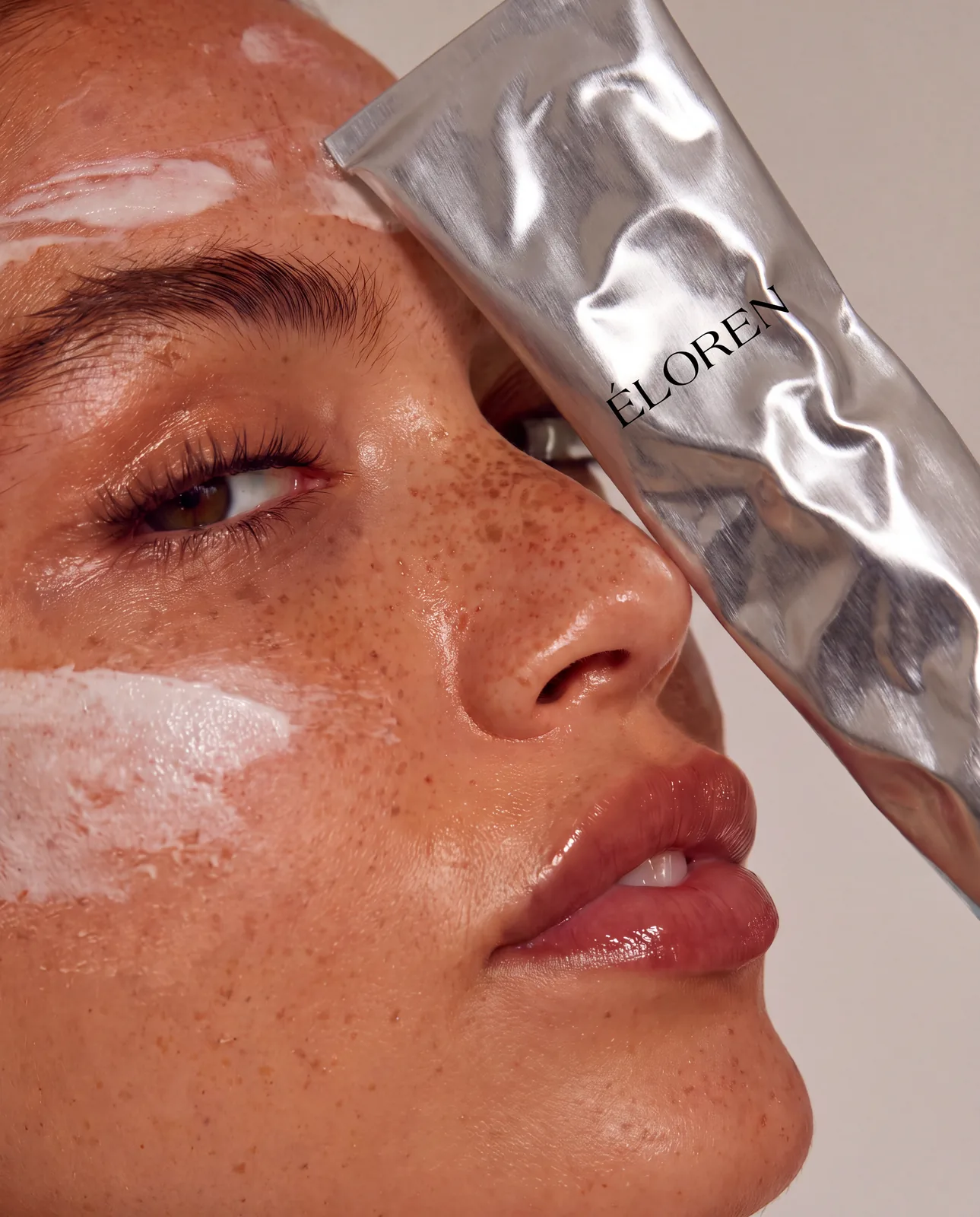
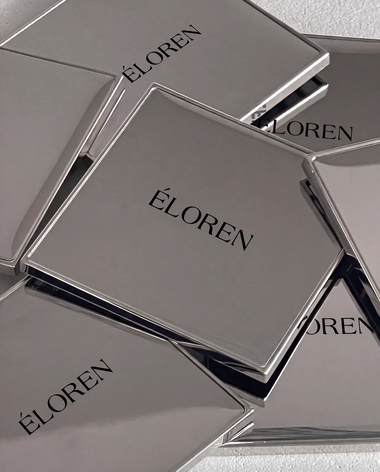
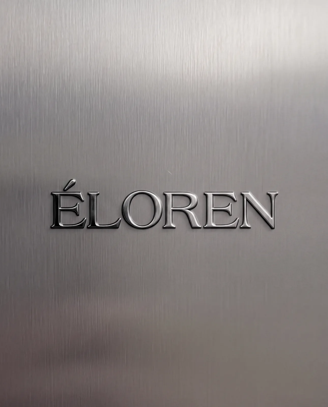
Instead of the soft pastels common in skincare, the brand is anchored in metal. Silver, brushed aluminium and polished chrome give the products a precise, almost clinical finish, while warm skin tones and natural light in the imagery keep the brand personal.
Logo Design
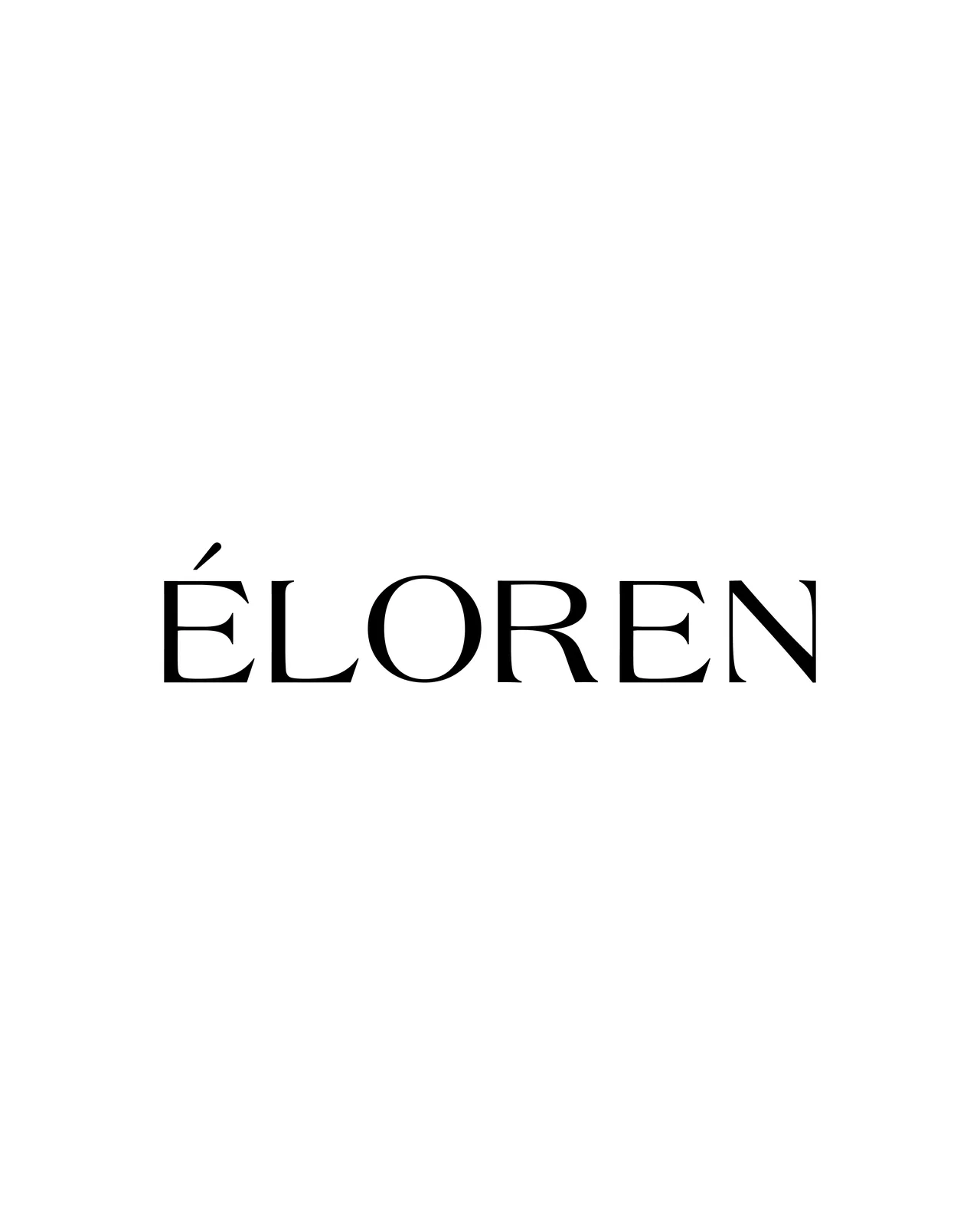
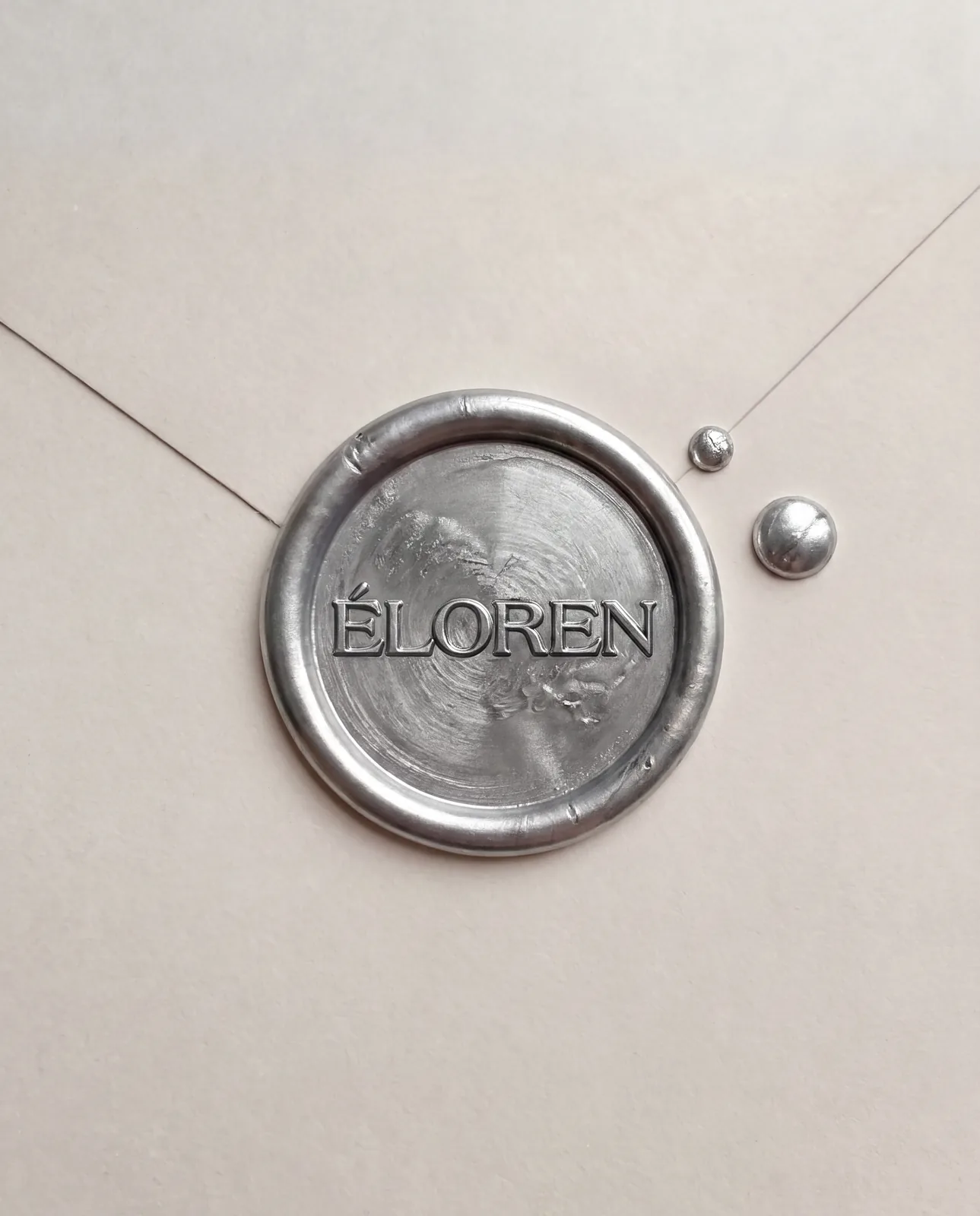
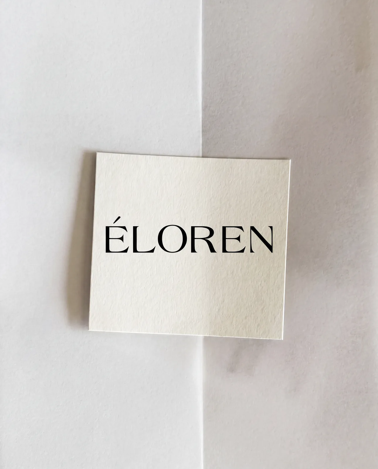
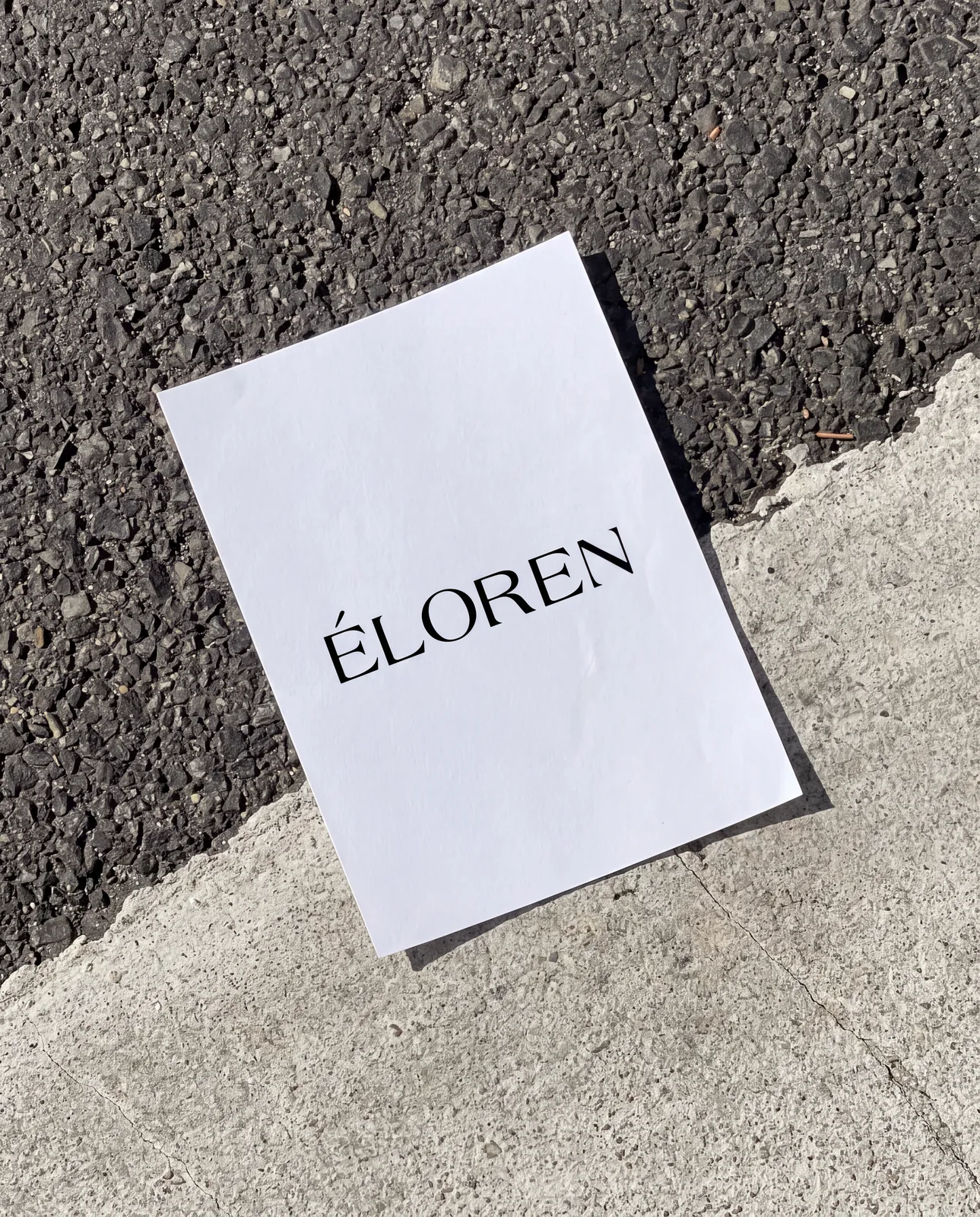
The wordmark sets ÉLOREN in wide uppercase letters with a flared serif: strokes taper gently into fine, wedge-like serifs, giving the name an elegant, slightly carved quality. A long, angled accent over the É becomes the identity’s one distinctive detail. The mark is kept simple so it can be embossed in metal, printed on paper or pressed into a wax seal without losing its character.
Colour & Materials
Black lettering on silver, white and soft grey forms the core of the system. The palette is intentionally narrow, so materials such as foil, brushed metal, glass and paper become part of the identity.
Packaging
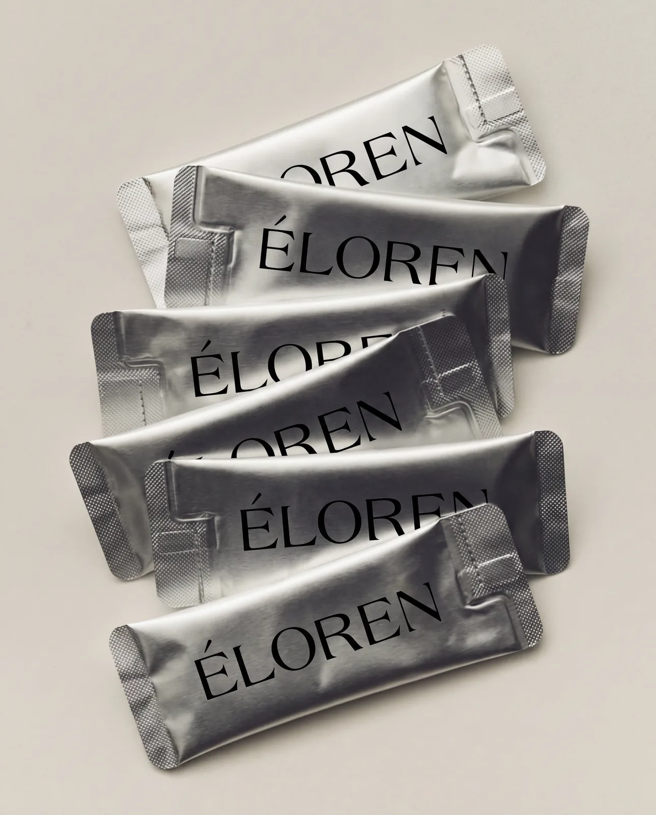
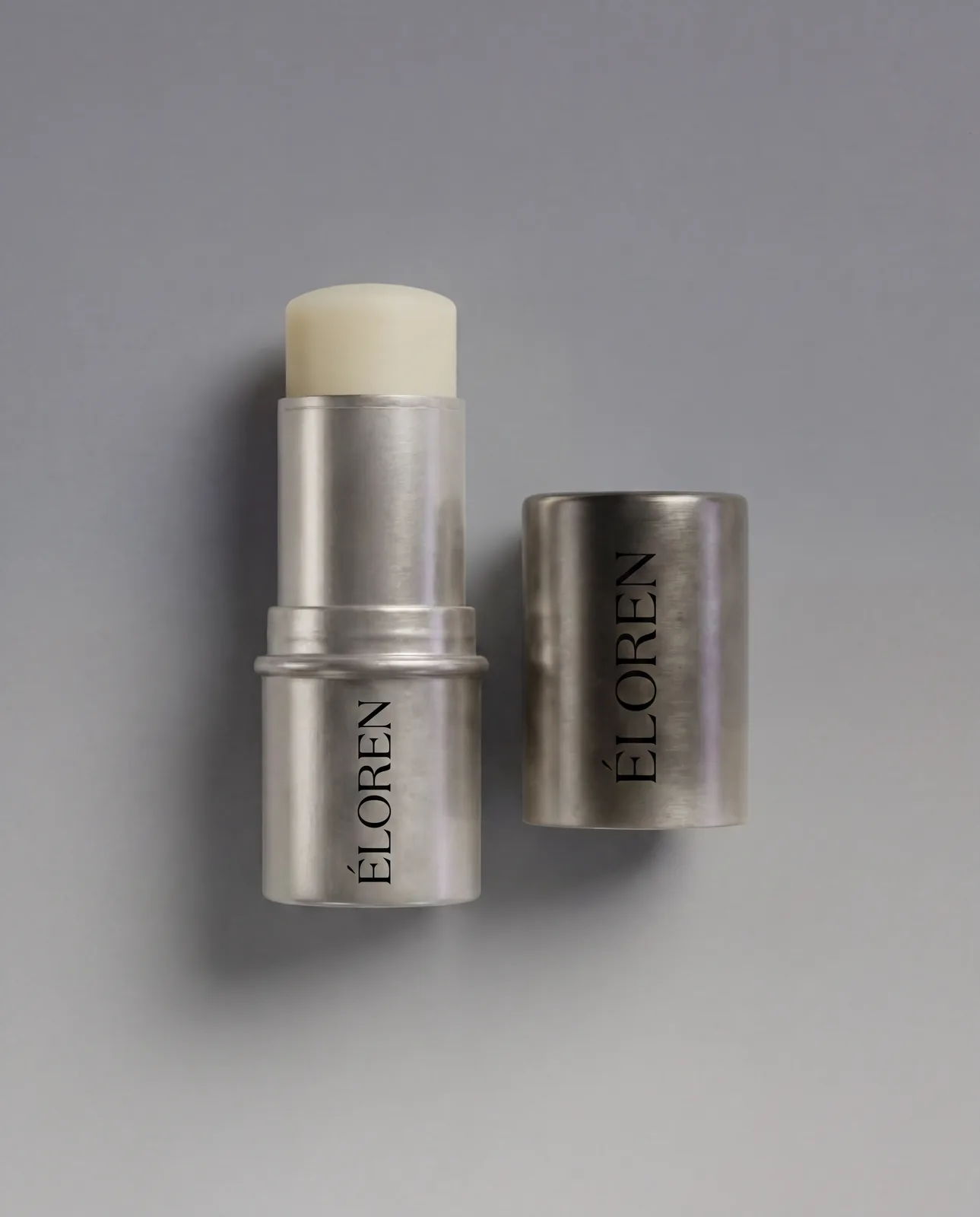
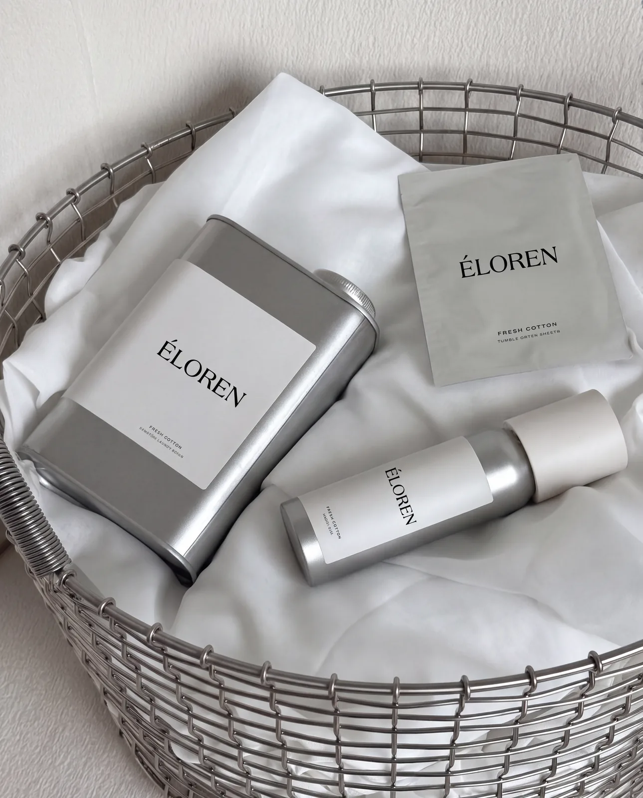
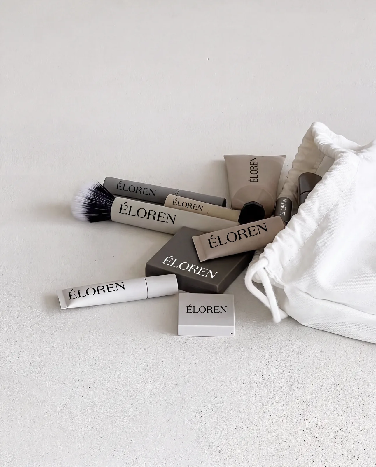
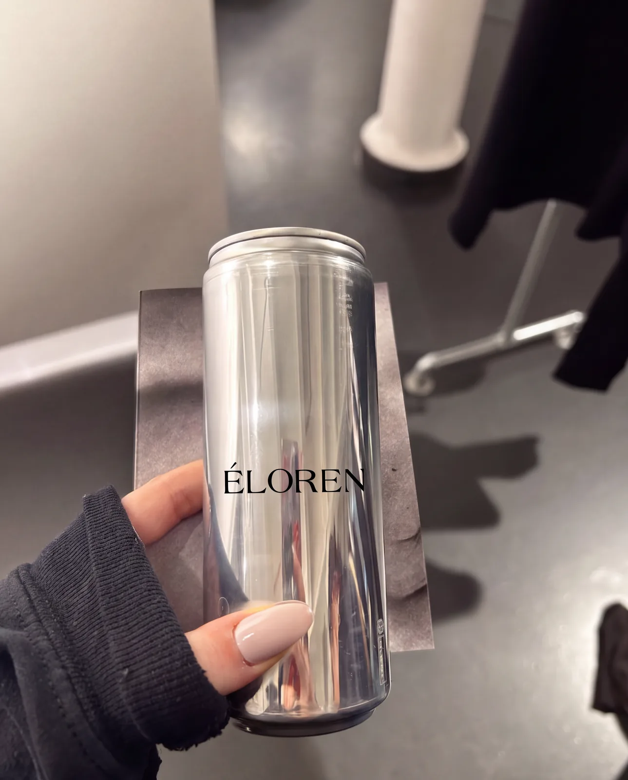
The identity was developed across squeeze tubes, single-use sachets, compacts, a balm stick, a tin, bottles, an aluminium can, makeup brushes, small boxes and a cotton pouch. A consistent silver finish ties the range together, with the wordmark placed simply, often vertically, to follow the proportions of each product.
Brand Expression
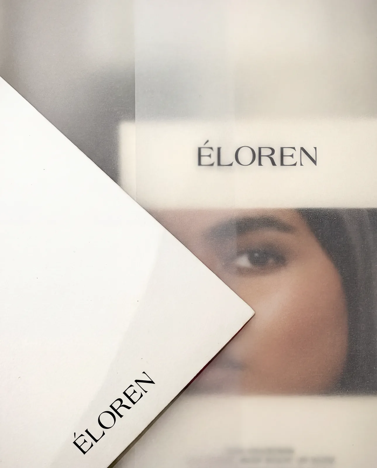
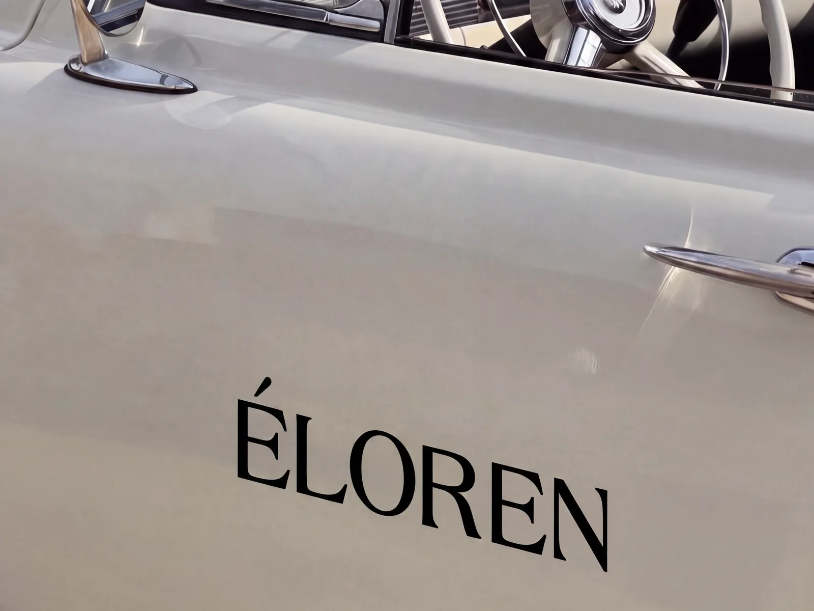
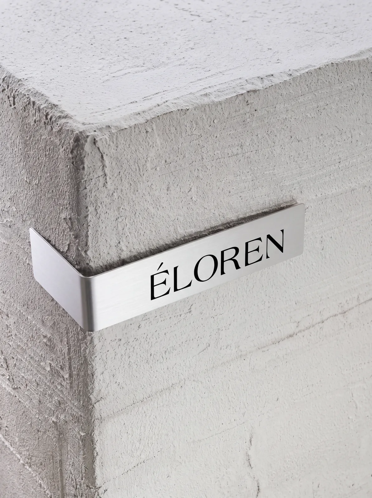
Beyond packaging, the brand was explored on wax seals, metal signage, printed cards, vehicle lettering, editorial layouts and lifestyle imagery, showing how the same restrained system moves from product to campaign.
Result
A calm, metallic beauty brand that feels premium through restraint — recognisable by its wordmark and its material rather than by decoration.
Services
Brand Identity · Logo Design · Packaging Design · Art Direction · Visual System
Project Type
Independent conceptual case study.