Gaisson Candle
Introduction
Gaisson is a conceptual candle brand created around atmosphere, nature and quiet luxury.
The Concept
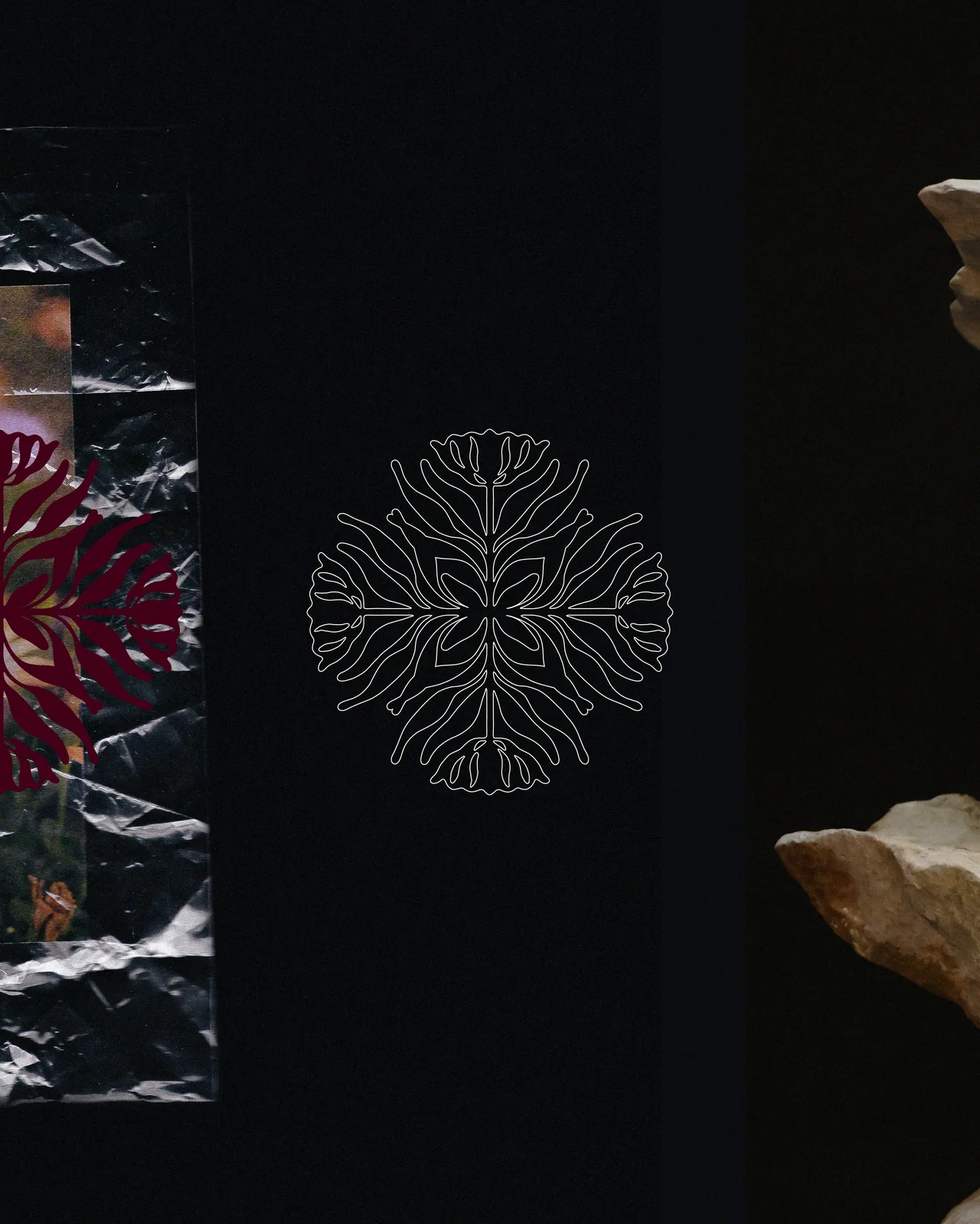
The identity brings together organic forms, tactile materials and a dark editorial mood. It was designed to make each candle feel like a considered object rather than a simple home accessory.
Logo & Symbol
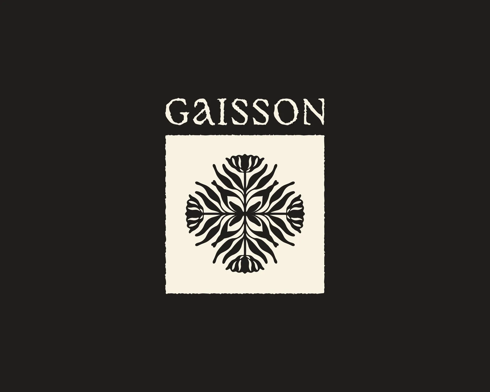
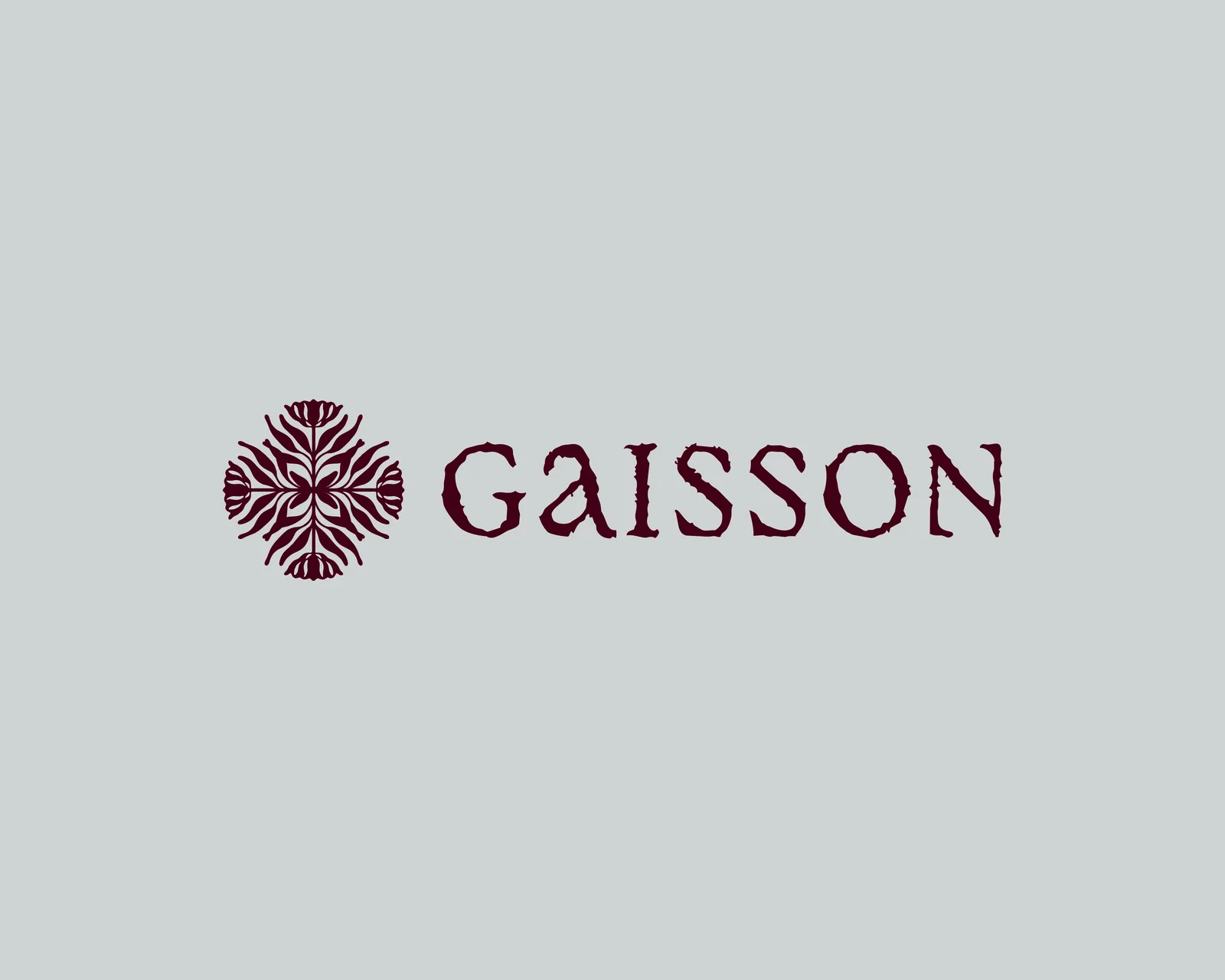
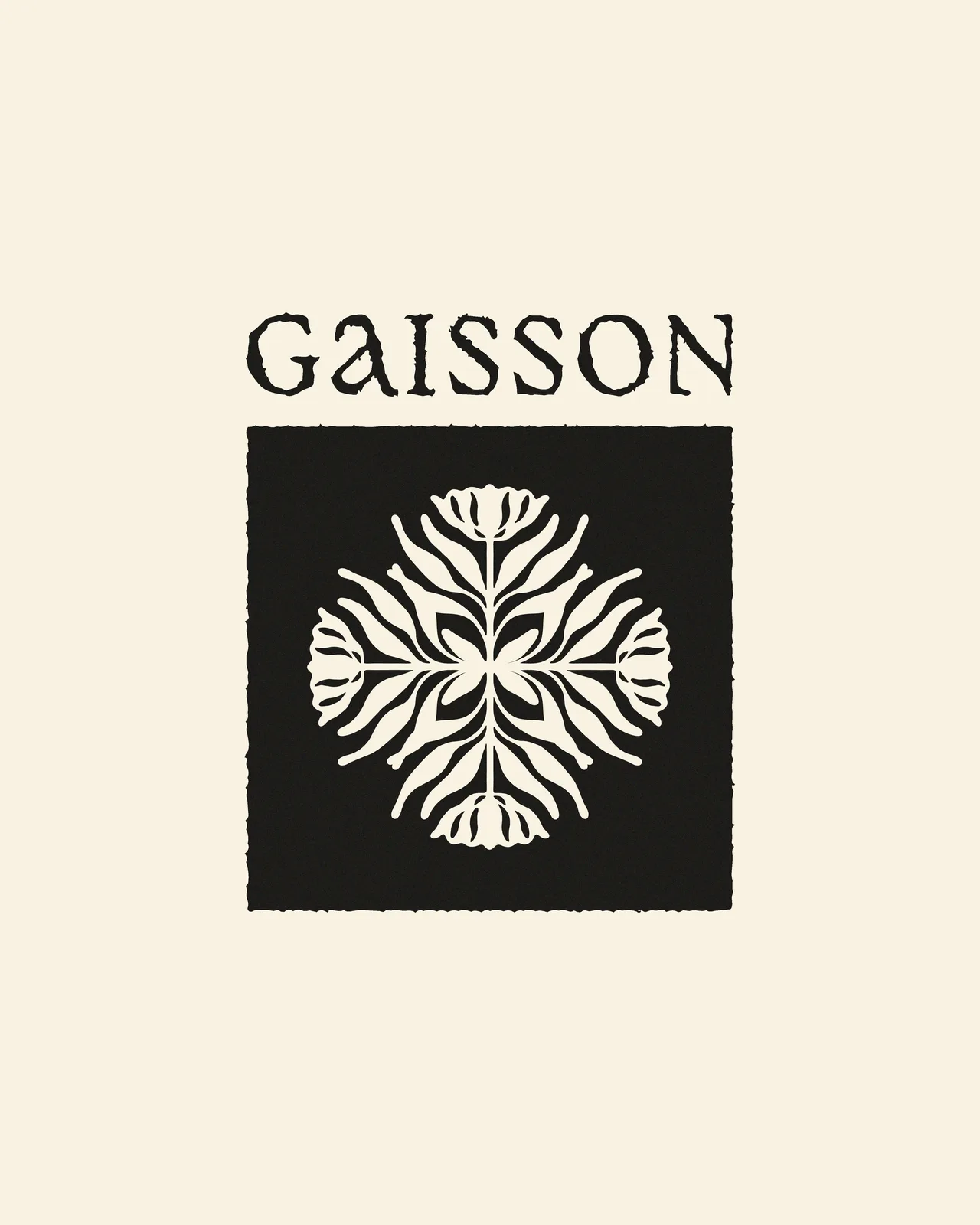
The floral emblem is built from mirrored botanical shapes, creating a balanced and distinctive symbol. The textured wordmark adds an artisanal character while keeping the identity refined.
Packaging Direction
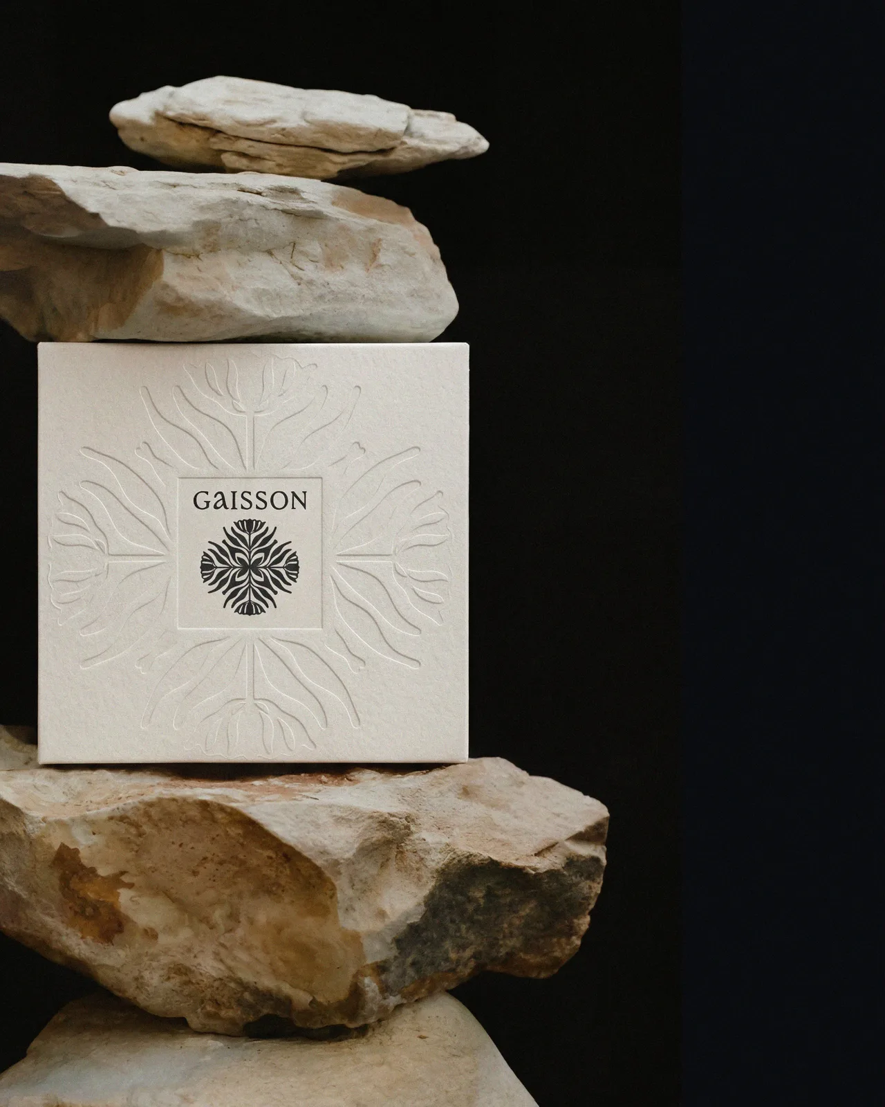
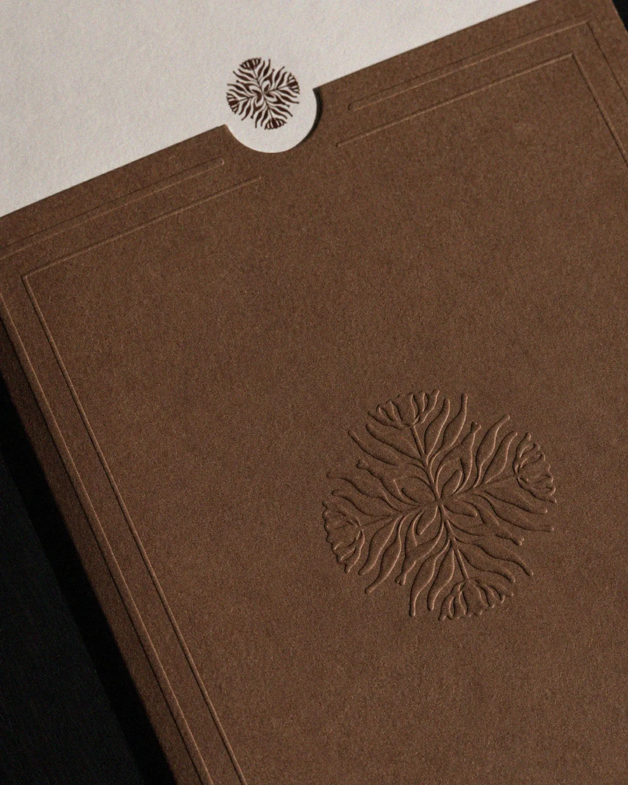
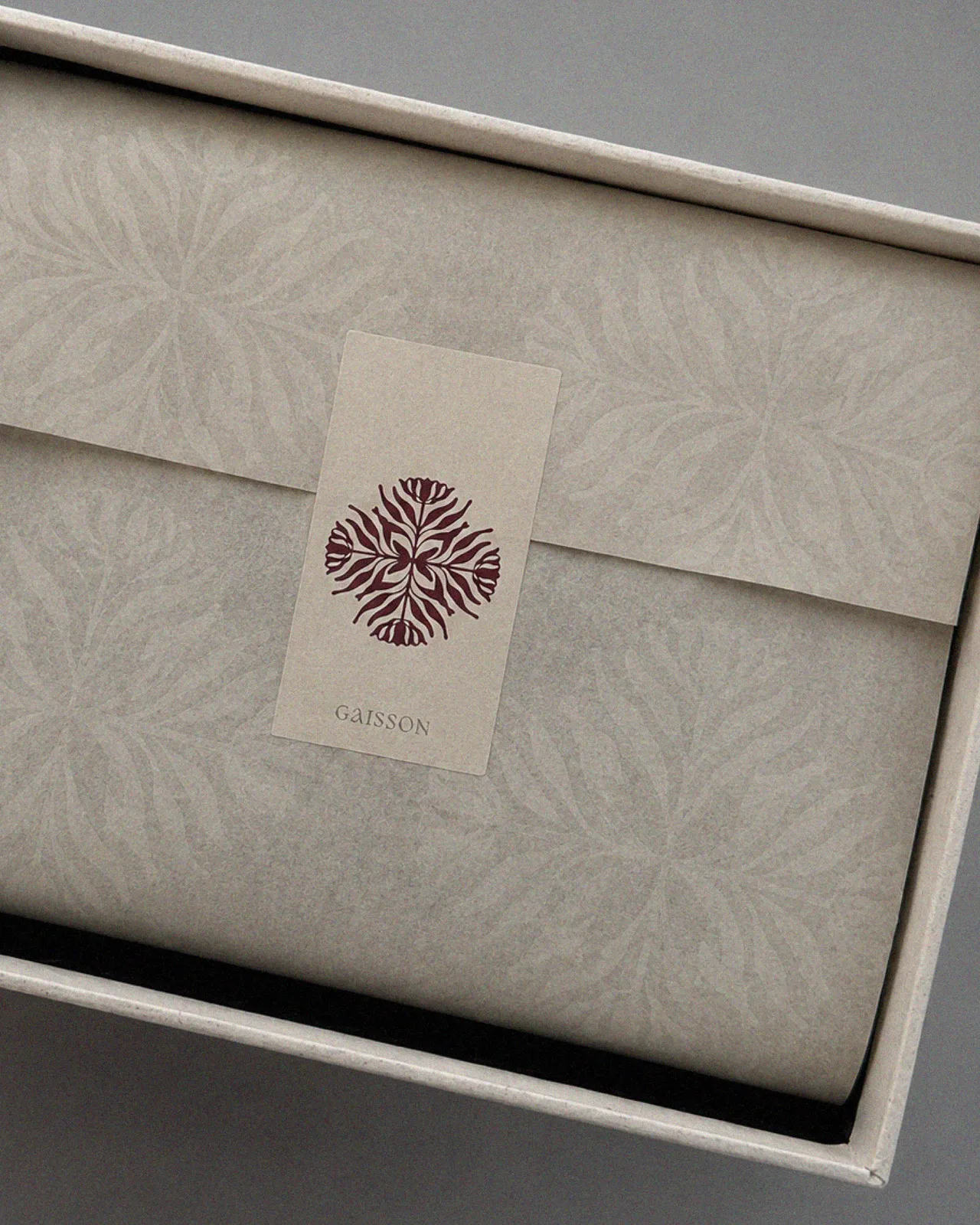
Embossed details, textured papers and minimal labels give the packaging a premium, handcrafted feel. The symbol remains the main visual signature across boxes, tags and candle vessels.
Colour Palette
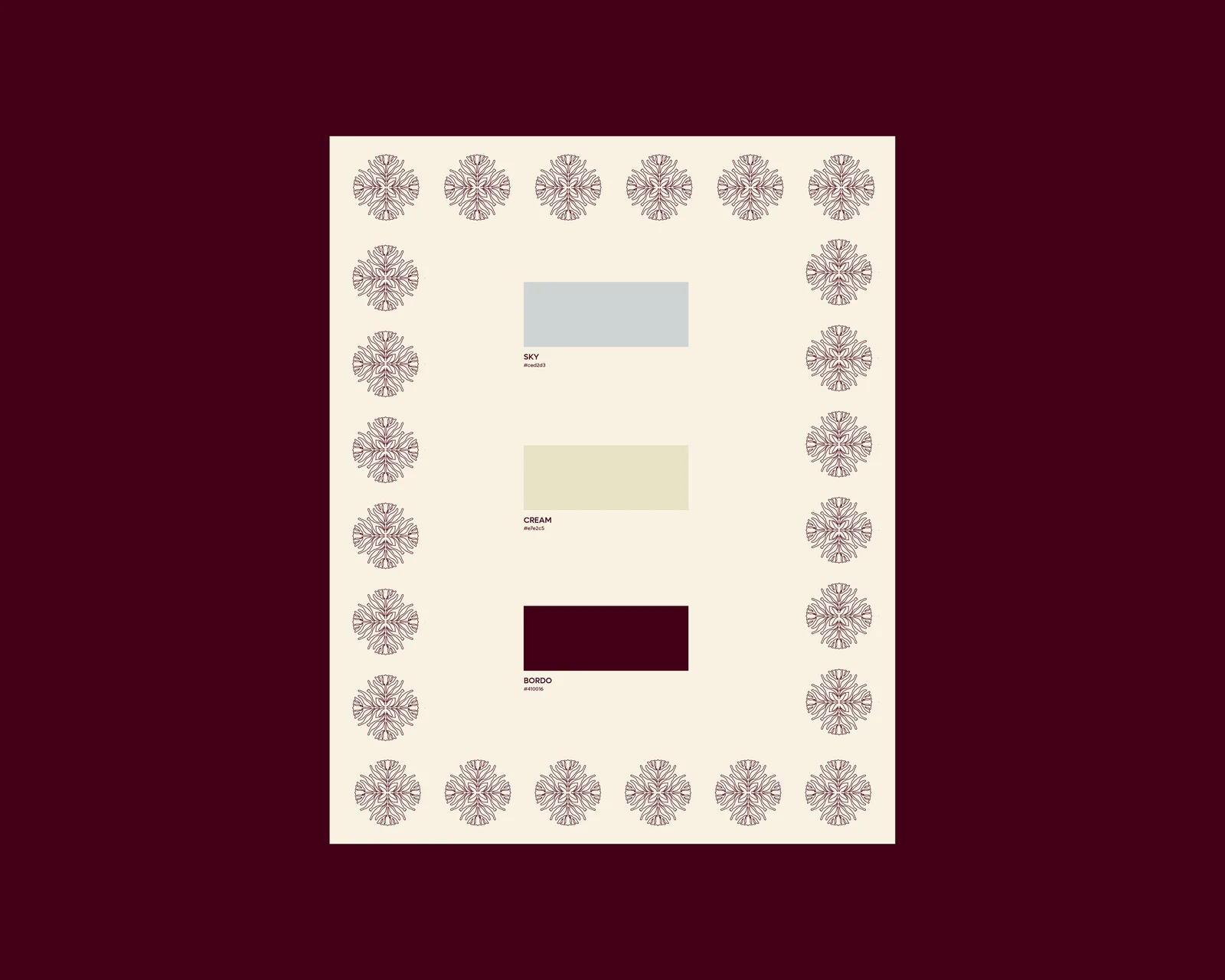
Cream, soft grey and deep burgundy create a calm, sophisticated palette inspired by stone, flowers and warm candlelight.
Services
Brand Strategy · Logo Design · Visual Identity · Packaging Direction · Pattern Design · Colour Direction · Creative Direction
Project Status
Independent conceptual case study.