Matcha

Overview
A contemporary identity for a premium matcha brand, balancing Japanese tradition with a softer, more approachable visual language.
The Direction
The concept moves away from overly traditional tea branding, creating something minimal, warm and relevant to a modern lifestyle audience.
Visual Identity
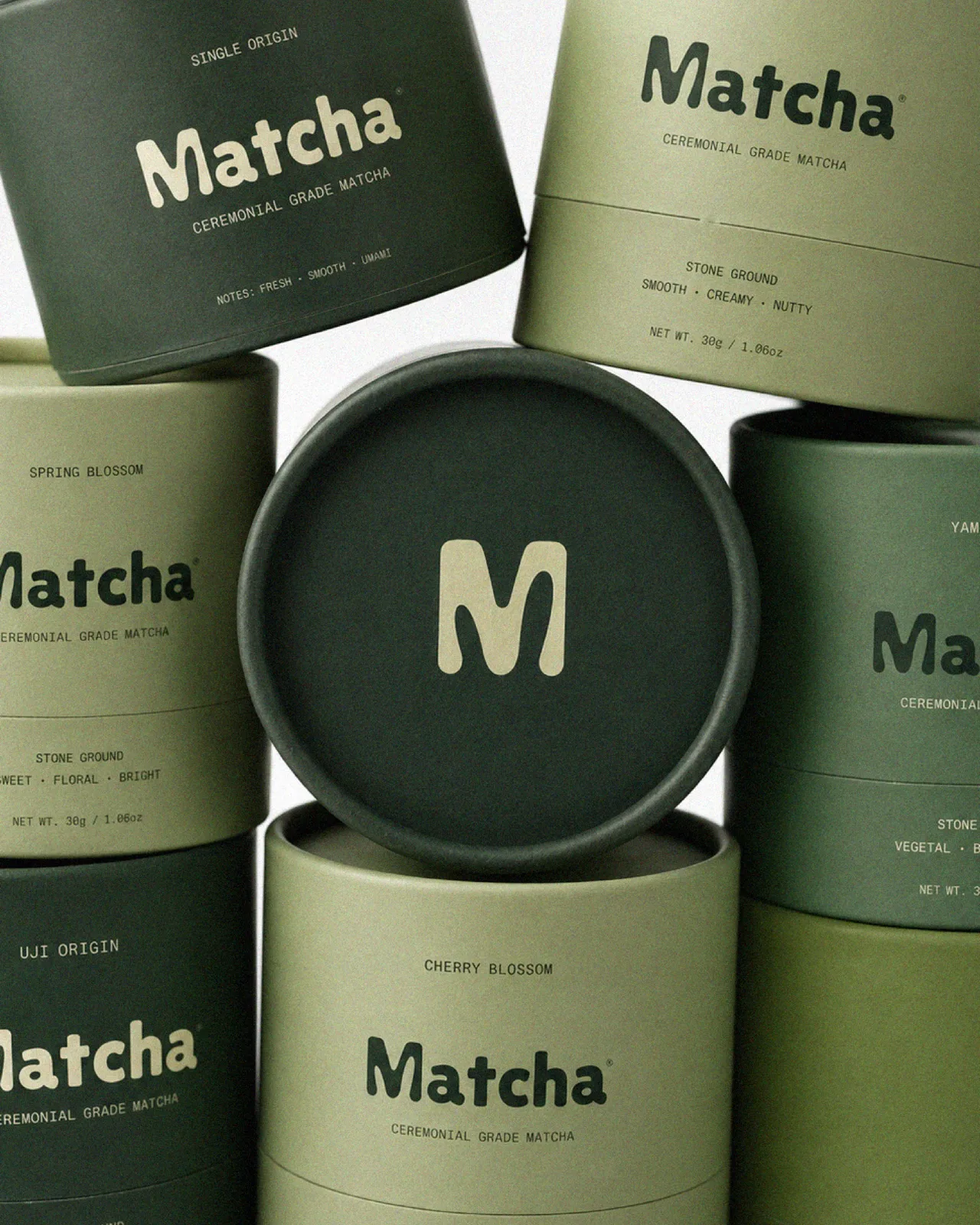
A soft custom wordmark and expressive M symbol give the brand a distinctive, organic personality while keeping the system simple and recognizable.
Color System
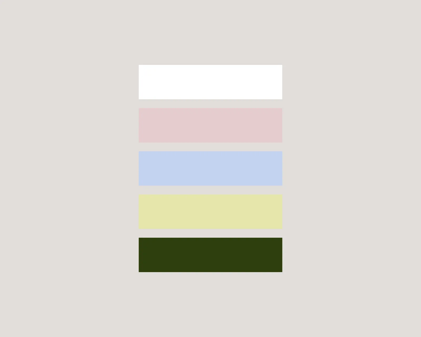
Muted greens, soft yellow and natural tones reference matcha itself while creating a calm and tactile visual world.
Packaging
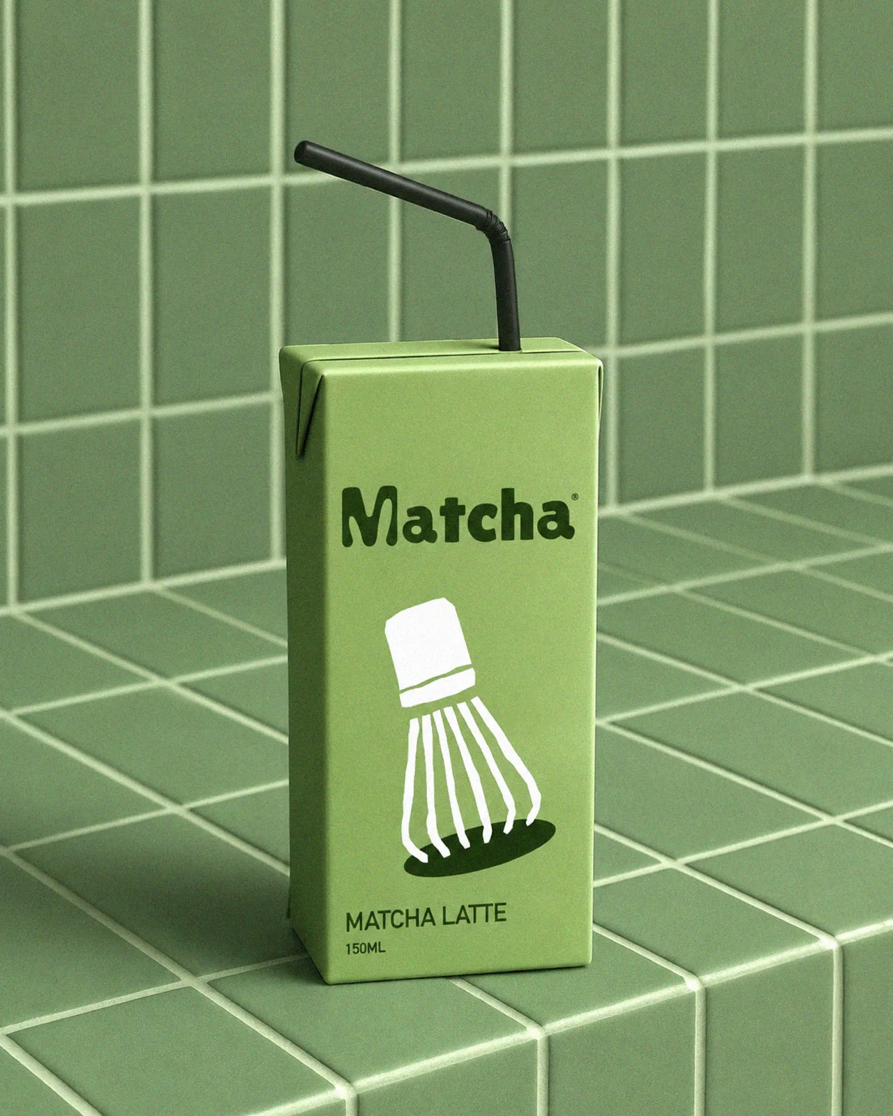
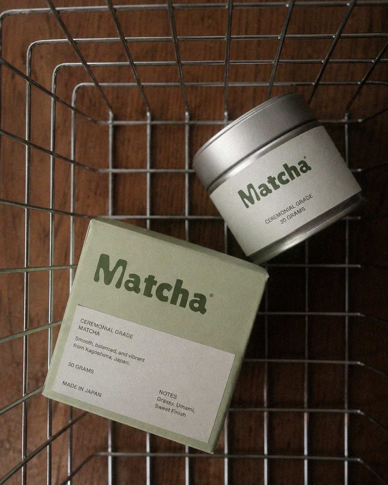
The identity was developed across ceremonial matcha tins, boxes and ready-to-drink packaging, using minimal typography and clear product information.
Result
A flexible matcha brand that feels premium without becoming overly formal — simple, natural and easy to recognize.
Services
Brand Identity · Logo Design · Packaging Design · Art Direction · Visual System