SeaSalt
Overview
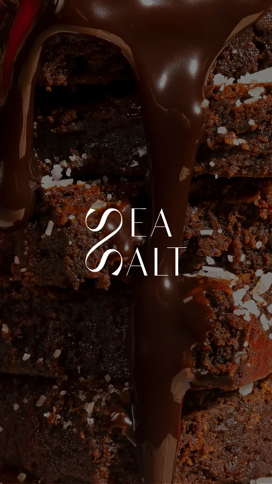
A premium chocolate brand identity built around the contrast between richness and simplicity, inspired by the balance of dark chocolate and sea salt.
The Direction
The visual concept combines an elegant editorial character with a minimal contemporary system, creating a brand that feels sophisticated, calm and distinctive.
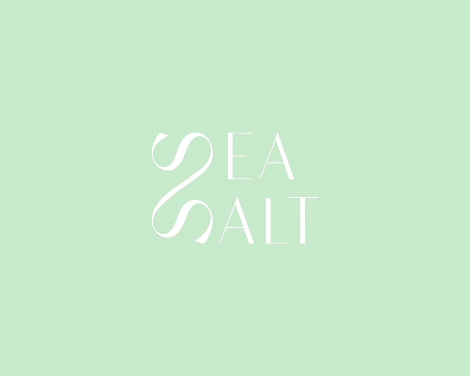
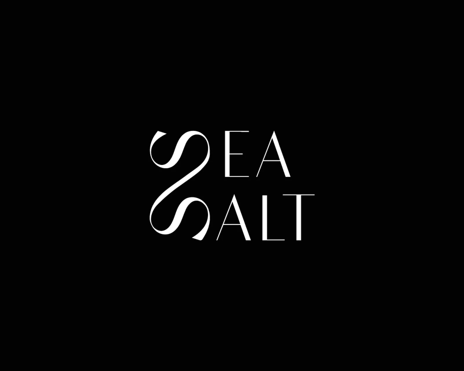
Visual Identity
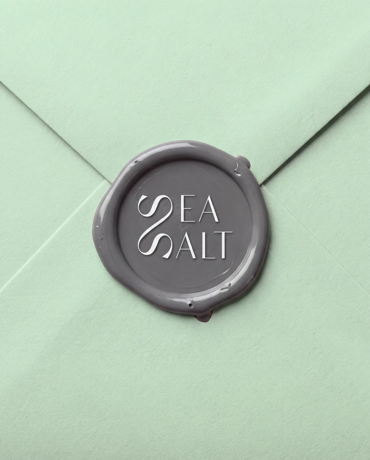
The SeaSalt wordmark uses flowing letterforms and sharp contrast to create a recognizable identity that feels both refined and slightly unexpected.
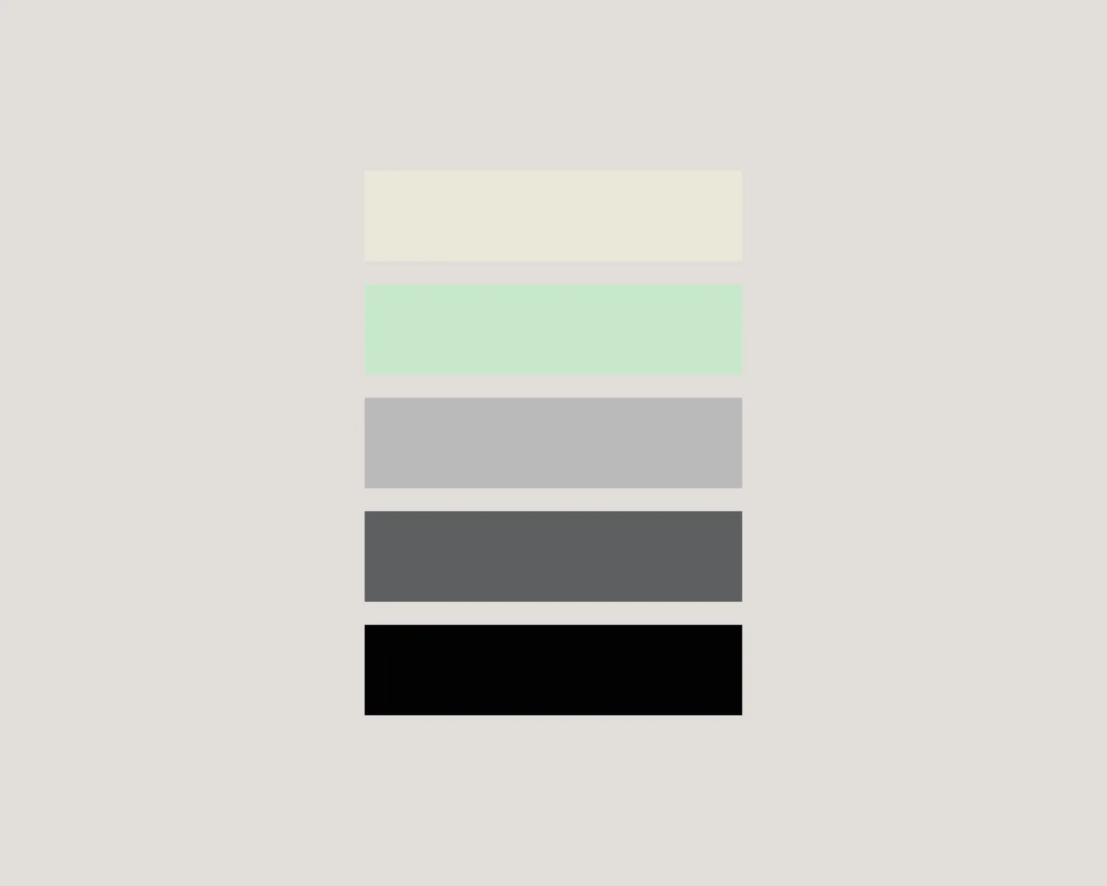
Color System
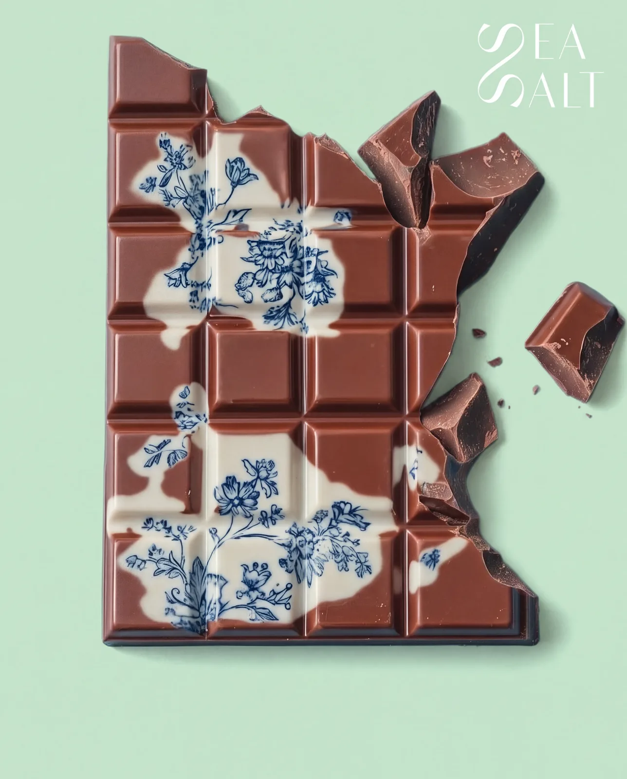
Soft mint, warm ivory, cool grey and deep black create a restrained palette inspired by sea air, salt crystals and dark chocolate.
Brand Expression
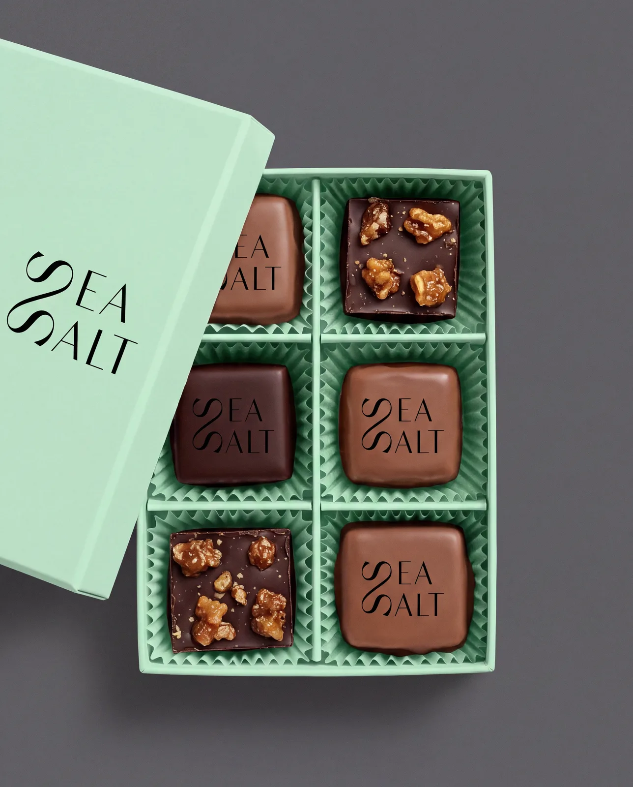
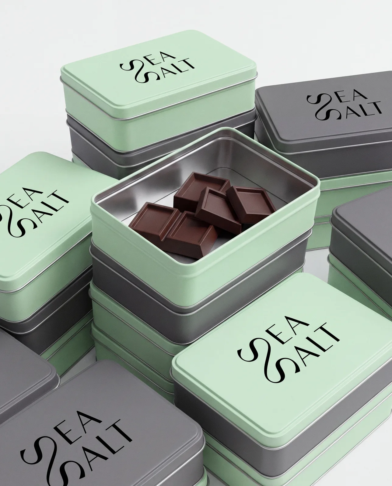
The identity is designed to work across packaging, product labels and branded touchpoints while maintaining a clean, premium presence.
Result
A minimal chocolate brand with a more fashion-led and editorial personality — luxurious without relying on traditional luxury cues.
Services
Brand Identity · Logo Design · Packaging Design · Art Direction · Visual System